- 0.1 Accessibility Resources
- 0.2 Who does what
- 0.3 Checklist
- 0.4 Screen readers we support and how to use them
- 1.0 Buttons and toggles
- 1.0 Bypass blocks
- 1.0 Focus Indicators
- 1.0 Images and Decorative Elements
- 1.0 Landmark structure- structuring elements correctly for screen readers
- 1.0 Modals
- 1.0 Tables
- 1.0 Tabs
- 1.0 Test Evidence Spreadsheet
- 1.0 Tooltips
- 1.1 Perceivable - Text alternatives
- 1.2 Perceivable - Time-based media
- 1.3 Perceivable - Adaptable
- 1.4 Perceivable - Distinguishable
- 2.1 Operable - Keyboard accessible
- 2.2 Operable - Enough time
- 2.3 Operable - Seizures and Physical Reactions
- 2.4 Operable - Navigable
- 2.5 Operable - Input Modalities
- 3.1 Understandable - Readable
- 3.2 Understandable - Predictable
- 3.3 Understandable - Input Assistance
- 4.1 Robust - Compatible
Buttons and toggles
Buttons
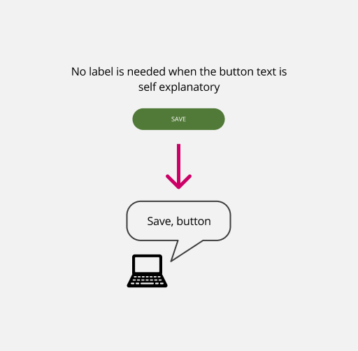
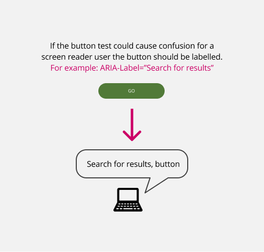
A standard button needs labelling if the text on the button is not informative enough. For example, a button that says ‘GO’ might not give the user enough information to know what that action will do. It is important that we do not rely on colour alone to show the state of the button.
Toggles
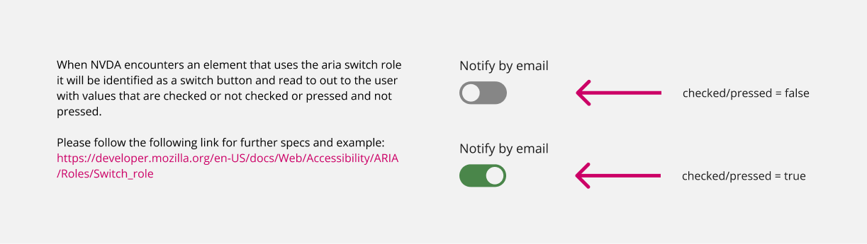
Toggles are used to switch between 2 states. A toggle must have a clear label indicating its function, using Aria-label or labelled by if needed and, like a checkbox, users must be warned if switching a toggle will result in a change of content
Toggles can be created in 2 ways. Replicating the function/code of a checkbox (type=checkbox) and using ‘checked’ and ‘unchecked’ to show the different states of the toggle Using the function of a switch (type=button) and using ‘pressed=true’ and ‘pressed=false’ to show different states of the toggle
Personally I would prefer to use the checked/unchecked state in order to avoid polluting the dom with extra buttons